The Big Picture

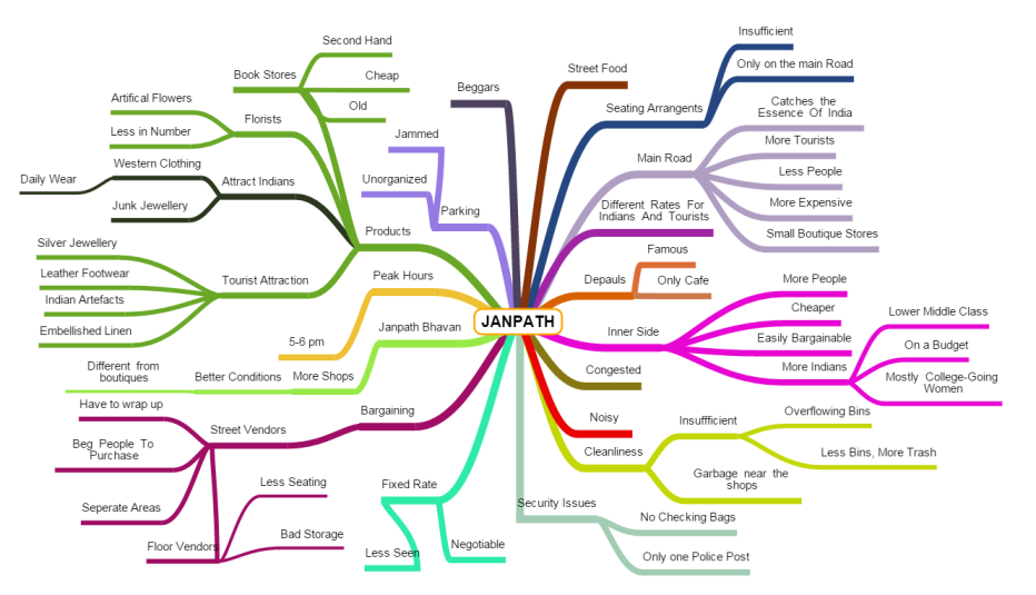
Janpath, a well-known market located in Central Delhi, near Connaught Place was collectively selected as the area for study. Now, the students were required to explore and survey Janpath and document their observations.

DSC_1416.JPG

A Peek Into The Inner Lane

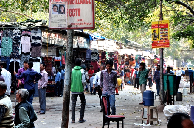
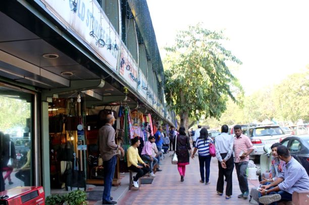
As I stepped into the market at 11 am in the morning, the market looked vacant and relaxed, opposite of what it’s known for. Slowly, vendors were coming to work, cleaning their spaces and arranging products. No one was much concerned with trying to sell us anything at this point, but just prepping for the day. Clicking pictures and doodling away, the clock soon struck 1. I noticed a significant change in two hours. The market got crowded and the vendors were pleading people to purchase their products. I saw a number of Indian women in their early twenties looking to find the best cheapest product. The products ranged from western clothes and junk jewellery to artificial flowers and old books. This of course was the situation on the inner side of the market. Outside, it was a whole other story. Small, identical boutiques that mainly catered to the needs and prices of tourists, stocked merchandise that strived to catch the “essence of India”. The merchandise included embroidered linen, Indian handicrafts, silver jewellery and souvenirs.

IMG-20160324-WA0011.jpg

Symmetrical boxes

These were my early observations of the interesting Market! Read my next post for more!

Weekly Essentials

My class decided to work on Janpath, a famous market in New Delhi, popular amongst both tourists and Indians alike.

Before we commenced fieldwork , we were required to create a mind map and also, a task sheet for what we planned to do once we reached the site. So, first my group created a mind map on a rough sheet and then, I faired it out online on a site called mindmapfree.com

janpath another one

Mind mapping!

We created the task sheet as a group on Microsoft Excel and the link is right below.

Tasksheet Macro

The Transition And Thereafter

The third module called Introduction to design tools and techniques, came to an end. It helped me understand the process of design and ultimately, enabled me to arrive at concrete outcomes using my understanding of various materials

Now, my fourth and last module of this year begins. It is called Design Process. And it requires the students to take a sequential approach and implement our learning of the foundation year. It is a self-driven module in which we are first to research and collect information; then, use design process to construct possible design solutions.

Before commencing with the module: Design Process, a prerequisite was to identify the differences between design, art and craft and design, decorating and styling.

Art, for me, is simply a manner of human expression. There is art of living, art of swimming, art of anything, really. Now, design is also an art, but it is art with a purpose. It is a layout, which is the way in which the parts of something are arranged. When one parks his or her car parallel to the sidewalk, it is practical therefore, it is a good design. If she or he parks it halfway across the street that disturbs the traffic, then it is a bad design. Now, craft is creating art or design, with the use of hands which may or may not have cultural significance.

Moving over to difference between design, decorating and styling. Design is, as I explained earlier, a layout whereas styling is designing in a particular manner or form. Lastly, decorating can be described as beautifying something by adding objects or even, pictures.

Now that my concepts are clear I can commence with my process of designing!

Thanks for reading my blog, Hope you enjoyed it!


Knowledge Has A Beginning But No End

The week of submissions. Tension and work grinding us down. Our minds giving in to the pressure. But, I am glad that at least my work is complete. We had to create minimum five swatches and I made 6. And I made sure I finished my blog, logbook, sketches and boards!


Researching and Learning about Pop Art, has been a very special journey. I learnt a lot, not only about different personalities but exactly how  Pop Art came into being and how it’s still affecting the society today. I am very Thankful to my teachers, Ms Astha, Ms Rikimi, Ms. Asha, Mr. Shovin and Ms. Deepti for helping me learn and understand the process of creating a product. We have learnt everything in such detail that it would be impossible, at least for me, to abandon my learning.


Tracing back, we started with the research, a 4week long research period in which we had write down whatever we found, wherever we found it. Then, we were asked to create a blog, to document the process that could be viewed by teachers and students alike. Once research was over, we created different design boards, mandatory for any project we take up after this. We created a visual board and sketched our ideas and designs. And then at the end, we used various materials to design and create our products; summing up everything we absorbed throughout this period of learning.


Now that my journey is coming to an end, I’d like to thank you all all for reading and liking my blog. The journey wouldn’t have been the same without your interest and enjoyement! Thank you again and all the best for your future endeavors! Bless up!

Finally, Over.

Ice-cream shop inspired products. I’d thought of the theme way back in Phase 1. Something I did not completely stick with though I predominantly used the same colours, I thought I’d Use. So, for my last swatch I decided that I WILL create something inspired by Ice- cream, no matter what. Such is my love for ice- cream and such is my stubborn mind.

12788822_10156712883600347_1086770484_o

Some Sketches Related To Ice-Cream

And I started. Having found my Pop-Art Soul mate in Mcdonalds, I went with the theme and used one of the coke glasses that had been lying around my house (having needed to buy 4 for my other swatch). I decided to make that my cone/ cup. I used some rolled magazine paper and covered them with coloured paper. This coloured paper was painted by me, with acrylic colours and not store bought. After creating a blue, yellow, pink ice cream I decided to colour the cup as well! And this was my result!

12809904_10156712886180347_1310580512_o


Thanks for giving my blog a read! I hope you enjoyed it !And if you did, please share it with your family and friends!

Pop Of Ideas!

POP! COLOURS! I wanted to show vibrant, bright colours in one of my swatches! I started playing with colours! Coloured freely without any expectations or careful considerations. Soon I came up with a surface with simple pop-like spots using vibrant paints. I decided to use acrylic colours to create it but it didn’t seem complete. There was something missing. Ms. Astha advised me to use some everyday object that can be seen in Pop Art so often. She said I could use safety pins or nuts and bolts. I set out to find any object that was one, used on a regular basis and two, had the potential to be the cherry to my pie.  I found nuts and bolts, paper clips, rubber bands, hair clips. Nuts and bolts, did not suit the theme at hand as they had nothing to do with children. I thought of hair clips and rubber bands but somehow they just seemed more teenager than younger kids. And, I was left with paper clips. As I was finding ways to put the paper clips to some use, a design struck my mind. Unfortunately, this design would have been difficult to incorporate into my half-made swatch. Fortunately, I conceived an idea for a new swatch.

I thought I could use the paper clips to make an interesting game of Tic Tac Toe. I coloured the O’s red and the X’s blue. I also coloured the background, a little unevenly, just to give it a slightly rustic feel, while keeping in mind that it was meant for children.

12823163_10156712885475347_588061685_o

Tic Tac Toe

I consulted Ms. Astha yet again, and she provided me with new ideas. She said suggested me to use children’s blocks, or Lego parts or parts from the game “Mechanix.” I took her advice and went on a search to look for anything related to children and small parts. Hopefully, I’ll find it!

12788623_10156712883890347_948558511_o

Anything Better Than Nuts And Bolts


Was It Worth It?

The other day, my younger sis was enjoying a happy meal. I noticed the glass of coke. The cap of the glass itself was a great piece, I thought. I wondered if I could maybe, work with it. The next day, I went to Mcdonalds and asked the cashier whether it would be possible to purchase a few caps. Sadly, it was not. The manager informed me that selling any containers was against company policy. As thrifty as I am, I looked around for spare caps on the food tables but unfortunately, hardly any person had come out to eat that day. Great luck isn’t it! So, I went back and purchased four medium cokes!

I tried and failed. Always trying with 3 different colours on each cap, but just didn’t work out. I took a step back and decided to use only two colours per cap. This worked!

I used a blue, red, violet and green with yellow, initially. But, soon after, I changed that to only hues and shades of pink and blue. Even the fries I made earlier were coloured pink, blue and yellow. I observed, my mood and colour boards had been on point since I ended up using the same colours I intended to use before. I was proud of myself!


Click the link to the next blog post to know about my last two swatches!

Post Its, Really?

Post its. I had numerous in varied colours. Why not create something with them, I thought. Since, we were permitted to create a surface as a swatch; I decided to do just that. I arranged the colours in diverse ways and created a rug-like surface that could also be used as a bed cover, a wall hanging or a cushion cover. After the surface was built, it looked like a rug that would be placed inside children’s play rooms or a playschool classroom.

The next day, I went up to Ms. Astha and showed her the swatches I recently made. She asked me, “why not create products that would appeal to children or things that you would see in a children’s room?.” Hmm. I wondered, why not. I had already created this colourful rug with primary and secondary colours, also recreated a fast food product that appeals to most kids nowadays, so why not go  towards the same direction!

12787283_10156712898880347_1799291198_o

Focussed on Pink, Yellow And Blue

Thanks for reading my post! Read the next one to know about the next swatch I created.

The Start of Something New

Now it was time to create swatches! According to our materials teacher, Ms Asha, the more materials, the better it would be. But first, we were required to draw sketches. A task. Not because it is difficult to draw, but because drawing is not something we are used to doing right before creating something. I understood that the process of manufacturing a product was what we were being taught. So, I started sketching right away.


While going through Pinterest to find something inspiring, I came across a pack of open skittles which were arranged according to their colours. That gave me my first idea which was  to find a commercial product and form something colourful that would justify my theme as well. I thought of a number of brands available in India like Parle G, Gems, Camlin Paints, etc. Finally, I rested upon the notion of using McDonalds fry box and fries as my inspiration or product; and I sketched the different ways in which I could create anything that would expand my notion.


Mood Sets The Colour

Inspecting Andy Warhol and masterpieces, what kind of mood did it set? And more importantly, what mood did I want to set? It all depended on what I wanted my end product to be. Initially, I had thought of creating an ice cream or candy shop inspired products. Therefore, choosing corresponding colours for my mood board were necessary. After going through some colour palettes, I decided on pink, yellow and blue. All bright, peppy and optimistic. Enough for a sugary candy shop. So I set forth on finding pop art pictures that possessed the colours, blue, pink and yellow.

After discovering a number of pictures, I started creating my mood board. I found a geometric layout to be most aesthetically pleasing, so I went with it. My board on Photoshop, same as the two boards before this.

mood


After completing the Mood Board, My “Design Concept” teacher, Astha ma’am allowed me to create the colour board simply by using one of the pictures from my mood board. So I did. And my boards were finally ready!

colour board

Thanks for reading this post! Share it with your friends if you liked it!